
Written by Jennifer Morton | SHOP! Marketplace 2026 Series Part 1 of 3
Walk into ten pro shops this season and tell me what you notice. Beautiful product. Tidy fixtures. And… a whole lot of the same.
Soft whites. Warm grays. Natural wood. The occasional touch of green. It’s tasteful. It’s safe. And it’s slowly erasing the one thing that should make our shops impossible to forget — the personality of the club itself.
At SHOP! Marketplace this year, I sat in on a session where a designer named it out loud: “The Beige Effect.” She walked us through new-concept and flagship retail spaces opened in the last 12 to 18 months — from quick-serve restaurants to luxury fashion — and asked the room a simple question: Can you even tell who these brands are anymore?
It hit me hard, because I think we have the same problem in golf retail. And it’s worth talking about.
Why we all defaulted to beige
There are good reasons we ended up here. Neutrals are flexible. They photograph well. They let the merchandise speak. They’re forgiving when assortments shift season to season, and they don’t fight the architecture of an older clubhouse. From a pure operations standpoint, beige is a rational choice.
Color psychology backs it up, too. Soft neutrals read as calm, stable, and understated — qualities that match the unhurried pace of a club experience. There’s even generational data suggesting younger shoppers are drawn to neutral palettes as a kind of visual exhale from a noisy world.
So beige isn’t wrong. The problem is when beige is the whole story.
The question worth sitting with
If a member walked into your pro shop with the logos removed, would they still know whose club they were in?
That’s the test. Because the moment your shop becomes indistinguishable from the resort gift shop down the road, you’ve handed away one of your biggest competitive advantages — the fact that your club is unlike any other.
Beige as a foundation, not a finish line
Here’s the reframe that stuck with me. The designer’s argument wasn’t “stop using neutrals.” It was “stop ending with neutrals.”
Think of beige as your ground floor — the stable, supporting layer that lets everything else stand out. The personality, the story, the sense of place — those come from what you layer on top. And in retail design, that layered approach has a name: a kit of parts.
A kit of parts is the collection of elements that bring a brand to life across every touchpoint of the space. It’s intentionally modular, so it can flex with seasons and refreshes without blowing up the whole shop. For a golf retailer, I’d think about it in five layers:
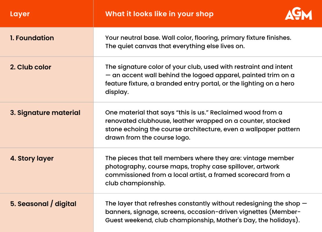
Notice that only one of those five layers is the neutral. The other four are where your shop earns its identity. And four out of five is the right ratio — enough personality to be unmistakably yours, enough restraint to keep the merchandise as the hero.
Define your non-negotiables
Before you start adding layers, define what cannot be touched. Every brand has them — the elements that are so essential they appear consistently no matter what changes around them. For a private club, your non-negotiables might be:
- The crest or logo treatment — always the same proportions, always rendered the same way.
- The signature color — the exact PMS, not a close cousin.
- A typeface — one display font and one body font, period.
- A defining material or texture — the one thing a member would point to and say, “that’s so us.”
Everything else — fixtures, vignettes, seasonal accents, digital content — can flex. But the non-negotiables are what hold the identity together across every refresh.
Where to start (because nobody has the budget to start everywhere)
If reading this has you mentally redoing the whole shop, take a breath. The most effective brand expressions are usually small, deliberate, and high-leverage. A little color goes a long way — if you place it well.
Five low-cost, high-impact ways to layer personality into a neutral shop:
- Branded entry portal. A painted archway, color-blocked threshold, or accent wall at the door signals “you’ve arrived somewhere specific” before a member sees a single piece of merchandise.
- Accent lighting on hero fixtures. Warm picture lights on a feature wall. A pendant over the logo wall. Light is the cheapest brand color you’ll ever buy.
- A story moment. One curated vignette — a framed historic course photo, the club’s first scorecard, a glass-cased trophy — placed where members linger near checkout.
- Local-artist programming. Rotating original work from a local artist or club member. It says “we are here” in a way no national brand can replicate.
- A seasonal portal. Change one feature — a window, an entry wall, a hero fixture — four times a year. Members notice. Photos get shared. The shop never feels frozen.
A note for multi-property operators
One of the smartest cautions raised at SHOP! was about flagships. Big brands love them — a single stunning store where the new design language gets piloted. But a flagship is one store. Members and guests experience the fleet. If your flagship tells one story and the rest of your operations tell another, you’ve created two different brands under one roof.
If you operate multiple properties, or a main shop and satellite locations, your kit of parts is what keeps the family resemblance intact. Same foundation, same non-negotiables, same signature material. Different story layers and seasonal moments. That’s how you scale identity without copy-pasting.
Where this leaves us
Beige isn’t the enemy. Sameness is. The shops that members remember — the ones that show up in their Instagram stories, the ones they bring guests to before tee time, the ones they actually buy from — are the shops that feel unmistakably like somewhere.
Your club is somewhere. Your shop should feel like it.
Try this week
Walk into your shop with fresh eyes — or better, ask a member to do it for you. With the logos hidden, what tells the story of your club? If the honest answer is “not much,” start with one layer. One portal. One vignette. One piece of signature material. Personality compounds.
Coming next in the SHOP! Marketplace Series
Part 2 | The 3-Second Shop: Designing Displays That Stop the Golfer
Part 3 | The Pro Shop as Fourth Space: Why Connection Beats Convenience
A companion worksheet — the AGM Brand Layer Builder — is available to AGM members in the online Merchandise Manual to help you map your club’s kit of parts. Click HERE to access it.
To join a merchandiser community and gain weekly educational opportunities and resources, sign up to become a member of the AGM.

By a Girl Golfer, for Girl Golfers: The Story of Calleigh’s Way
Learn how Calleigh’s Way is bringing style, function, and confidence to the next generation of [...]
Jul
Old Things, New Stories: Using Vintage and Everyday Objects in Retail Displays
Discover how vintage retail displays and repurposed everyday objects can add personality, history, and storytelling [...]
Jul
Be the Worst Where It Matters Least
Golf retail leadership means knowing what to prioritize. Discover how great leaders build stronger shops [...]
Jul

If Golf Clubs Could Talk: What Your Inventory Would Say About You
Learn what your golf shop inventory says about your business, from sell-through and displays to [...]
Jul
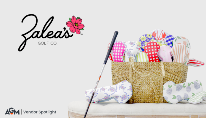
Bringing Joy, One Headcover at a Time: The Story Behind Zalea’s Golf Co.
From a college dorm room to golf shops nationwide, explore how Zalea's Golf Co. is [...]
Jul
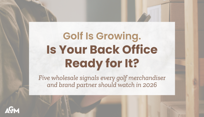
Golf Is Growing. Is Your Back Office Ready for It?
Take a look at these five wholesale signals every golf merchandiser and brand partner should [...]
Jul
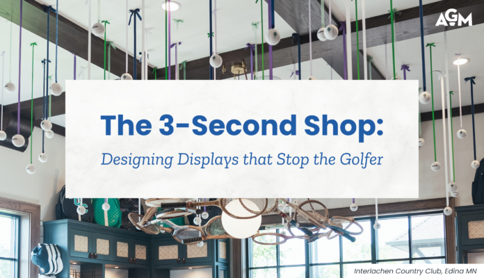
The 3-Second Shop: Designing Displays that Stop the Golfer
The 3-Second Shop reveals why golfers decide in seconds whether a display deserves their attention—and [...]
Jul
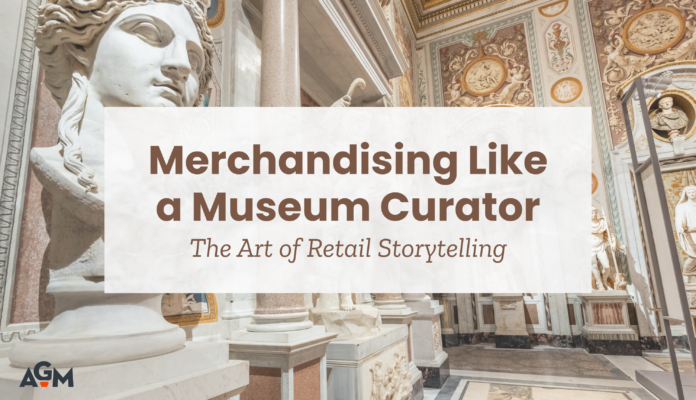
Merchandising Like a Museum Curator: The Art of Retail Storytelling
Discover how retail storytelling can transform golf shop displays into engaging experiences that guide members [...]
Jul