

Written by Ken Morton Jr.
When it comes to golf retail, your store’s visual appeal goes far beyond the products on display. The colors you choose for your walls, fixtures, props, and even floral arrangements can create a powerful emotional connection with your customers. By understanding color psychology, you can curate an immersive shopping experience that influences buying behavior, enhances customer satisfaction, and builds brand loyalty. Here’s an in-depth look at how you can use color to transform your golf retail store.
The Role of Color in Retail Design
Color isn’t just about aesthetics—it’s a critical tool that impacts mood, perception, and decision-making. Different hues evoke different emotions, which can drive specific behaviors in your customers. Whether you’re renovating your store or building new displays, thoughtful color choices can set the tone for your brand identity and make your store memorable.
From wall colors and fixture tones to the props and floral arrangements you use, let’s explore how strategic color use can change the emotional connection between your store and your customers.
Bold Red: Drive Action and Urgency
Red is one of the most stimulating colors in retail. Known for its ability to increase heart rates and create a sense of urgency, red is the perfect accent color for:
- Sale signs: Encourage impulse buying with bold red markdown tags.
- Window displays: Grab attention and drive foot traffic with red accents.
- Key areas: Use red to highlight promotional areas or limited-time offers.
A splash of red can inspire quick decision-making. However, too much red can be overwhelming, so balance it with neutral tones to avoid overstimulation.
Pro Tip: Pair red with white or light gray to maintain a professional look while still creating urgency.
Sunny Yellow & Orange: Create Optimism and Energy
Yellow, the color of happiness and positivity, is a fantastic choice for spaces where you want to convey excitement and energy. Its close cousin, orange, adds a layer of creativity and vitality.
Use these colors to:
- Highlight new arrivals: Yellow and orange are excellent for drawing attention to fresh stock.
- Create welcoming entrances: Bright entrance areas set a positive tone for the shopping experience.
- Build seasonal displays: These colors are perfect for summer-themed promotions and bright spring arrangements.
Yellow and orange work well together to create a high-energy vibe that invites exploration and engagement.
Pro Tip: Use yellow sparingly in spaces where customers linger to avoid overstimulation.
Refreshing Green: Promote Balance and Well-Being
Green is the color of nature, renewal, and balance. In retail, it brings a sense of harmony and relaxation, making it a great choice for areas where you want customers to feel comfortable.
Consider using green in:
- Reading nooks or seating areas: Encourage customers to pause and relax.
- Eco-friendly product displays: Green reinforces sustainability and wellness themes.
- Storefront plants and floral arrangements: Add life and vibrancy to your space with greenery.
Soft greens promote calmness, while brighter greens can energize and refresh the space.
Pro Tip: Incorporate green props, such as golf-themed plants or nature-inspired artwork, to tie into your store’s theme.
Calming Blue: Build Trust and Encourage Exploration
Blue is traditionally associated with trust, calm, and stability. Incorporating shades of blue can make your store feel more serene and professional.
Here’s how you can use blue effectively:
- Customer service areas: Create a calming, approachable atmosphere.
- Fitting rooms: Encourage customers to take their time and feel comfortable.
- Display backdrops: Use deep blues to add sophistication to premium product displays.
Light blues evoke tranquility, while deeper blues convey authority and reliability. Both are ideal for enhancing customer experience.
Pro Tip: Combine blue with natural wood tones for a modern, grounded look.
Energizing Purple: Inspire Creativity and Luxury
Purple is often associated with creativity, luxury, and uniqueness. While not as commonly used in retail, it can make your store feel distinctive and memorable.
Use purple to:
- Highlight premium products: Deep purples add a touch of luxury to high-end items.
- Create unique displays: Stand out from competitors by using unexpected color combinations.
Pro Tip: Pair purple with gold or silver accents to emphasize elegance and sophistication.
Elegant Neutrals: The Perfect Backdrop
Neutral tones such as beige, gray, and white provide a clean, sophisticated backdrop that allows your products and accent colors to shine.
Neutrals work well for:
- Wall colors: Create a timeless look that won’t clash with seasonal displays.
- Fixture tones: Use gray or wood tones to balance bright accent colors.
- Product displays: Neutral backdrops make colorful merchandise stand out.
Pro Tip: Add texture to neutral walls with wood paneling or stone elements to enhance the overall aesthetic.
Warm Browns: Create a Grounded, Cozy Feel
Earthy tones such as brown and tan create a warm, inviting environment that feels grounded and comfortable.
Consider using these tones for:
- Fixtures and furniture: Wooden fixtures add a rustic charm to your store.
- Props and accessories: Leather and natural fibers work well with golf-themed decor.
Pro Tip: Incorporate natural materials like wood, leather, and stone for an authentic, organic feel.
Putting It All Together: Creating a Cohesive Color Scheme
When choosing colors for your store, it’s important to create a cohesive scheme that reflects your brand identity and resonates with your customers. Here’s how to do it:
- Choose a primary color: This will be the dominant color in your store.
- Add accent colors: Use accent colors to highlight key areas and create contrast.
- Incorporate natural elements: Use plants, wood tones, and natural light to enhance your color scheme.
- Rotate seasonal colors: Update your displays with seasonal color trends to keep your store fresh and relevant.
Final Thoughts
Color is a powerful tool in golf retail design that can transform your customers’ shopping experience. By thoughtfully selecting colors that align with your brand and goals, you can create an environment that inspires trust, excitement, and loyalty.
Whether you’re planning a renovation or building new displays, keep color psychology at the forefront of your design strategy. The right colors can make all the difference in driving customer engagement, increasing sales, and leaving a lasting impression.
To join a merchandiser community and gain weekly educational opportunities and resources, sign up to become a member of the AGM.
Be the Worst Where It Matters Least
Golf retail leadership means knowing what to prioritize. Discover how great leaders build stronger shops [...]
Jul

If Golf Clubs Could Talk: What Your Inventory Would Say About You
Learn what your golf shop inventory says about your business, from sell-through and displays to [...]
Jul
Bringing Joy, One Headcover at a Time: The Story Behind Zalea’s Golf Co.
From a college dorm room to golf shops nationwide, explore how Zalea's Golf Co. is [...]
Jul
Golf Is Growing. Is Your Back Office Ready for It?
Take a look at these five wholesale signals every golf merchandiser and brand partner should [...]
Jul
The 3-Second Shop: Designing Displays that Stop the Golfer
The 3-Second Shop reveals why golfers decide in seconds whether a display deserves their attention—and [...]
Jul
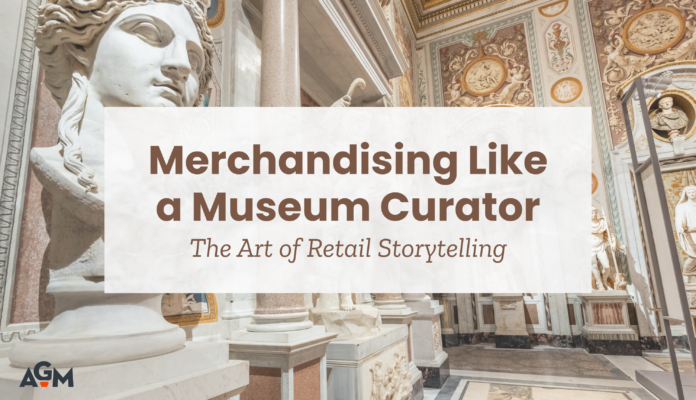
Merchandising Like a Museum Curator: The Art of Retail Storytelling
Discover how retail storytelling can transform golf shop displays into engaging experiences that guide members [...]
Jul
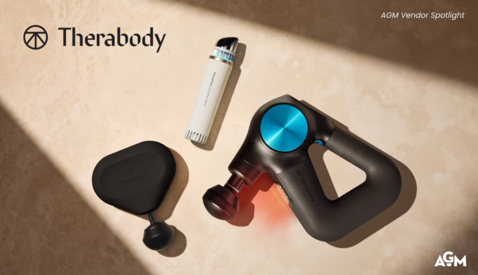
Beyond the Round: Therabody’s Approach to Everyday Wellness
As golfers prioritize overall well-being, wellness products are creating new opportunities for golf shop merchandising.
Jun

Golf Retailers Are Sitting on Their Biggest Competitive Advantage and Don’t Even Realize It
Golf retailers' biggest competitive advantage is human connection. Discover how community drives loyalty and sales.
Jun