

Guest written by Richard Fryer of Argali Custom Apparel | 7.5-minute read
Hat design is interesting in that, like a golf swing, someone could easily say: “don’t overthink it, just go swing the club.” However, if you do, you may miss the ball completely. With hats, if you proceed without a strong knowledge of the human eye’s classification of desirable versus hideous (haha sad but true) you are going to be left wondering why the logo never looked right.
You probably don’t think about it or verbalize it, but we all have universal rules regarding what looks attractive in terms of colors, sizing, shapes and other aspects of design that, if followed, make the ability to sell private label product somewhat simple. In a world like golf that is extremely conservative (although extremely dynamic and getting more expressive by the day), merchandisers have to be even more conscious of these rules to not violate them and ensure the culture of the course is not altered. The categories of rules that I have learned during my time designing clothing include: 1) Color Contrast 2) Proportionate Logo Shape and Size 3) Practicality and 4) Client’s Expression Preference. From my perspective, these rules define what is “easy on the eyes” compared to what is exhausting for the eyes to digest.
Let’s dive in to what these mean:
1) Color Contrast:
Have you ever heard the phrase: “that guy is dressed like a used car salesman?” Historically, the referenced person is wearing slacks, a shirt, a tie, and a sports coat that are all in different patterns and colors with little coordination. That lack of coordination speaks to this rule: in many cases, the human eye can start to feel visually overwhelmed once a third strong color is introduced in an ensemble (excluding white, black, and gray from the count).
As an example, many national flags use two colors along with white or black. Classic apparel, like tuxedos, also relies on simplicity in color. Simplicity is often seen as elegance (with some exceptions, of course). This point seems easy for most people to grasp, yet you still see it ignored often.
One of the exceptions to this guideline involves scale: if you have a number of shapes that are multi-colored and small, the eye may not feel as fatigued when taking the design in. In some cases, such as certain sublimated apparel, it may even enhance the overall look.
Another important topic to consider when discussing colors is the use of color families and groups. You might remember learning in elementary school about the term “monochromatic” which is a key concept in color coordination. This refers to using different shades, tints, and tones of a single hue, adjusting brightness and saturation while staying within one color family. The closer a design’s colors are to a monochromatic scheme, the easier it is for the eye to process, compared to the harsher contrast created by unrelated colors.
Similarly, when using multiple colors, the more they belong to the same group (such as primary colors, pastels, or earth tones), the more cohesive and visually pleasing the design will feel. However, in my opinion, the same “two-color” guideline applies even within a single color family. Too many competing hues can still overwhelm.
Ultimately, the relationship between colors and their contrast plays a critical role in how a design is received. Even the strongest concept can be rejected if the color palette is jarring or poorly balanced.

2) Proportionate Logo Shape and Size:
The size of the logo is clearly very important, and as the golf industry evolves toward more expressive styles, it’s important to understand your customers’ preferences while also exploring new possibilities with various logo sizes. The golf industry has traditionally liked muted colors, classic designs, and smaller logos. In the industry, hat creation usually includes designs that are less than two inches wide or tall, commonly around 1 to 1.5 inches in width or height.
On the front of most hats, it’s important to note that the maximum dimensions are generally between five and six inches wide and about 2.5 inches tall. Different applications, such as silicone patches, can sometimes accommodate larger sizes, but a typical golf hat logo is often a conservative crest or lettermark embroidered at roughly 1.25 inches tall and centered on the crown. If the person who selects hats for a club is willing to experiment and look at bigger logos (which I would highly encourage, knowing that customers are not just shopping at golf shops), it is important to know which logos are most appropriate for each style of hat.
Here are some general rules to keep in mind when determining the shape and size of a logo:
- The bigger the canvas, the bigger you can make the logo. “Hard shell” / “stiff front” hats allow for logos to have a larger canvas compared to soft shell hats that need to avoid a logo that will end up being stretched and may not translate as well if not applied to a hard shell front.
- The boxier the front of the hat, the wider you can make the logo. If the bill of the hat is flatter, it makes the hat look wider and as a result, a wider logo will look proportionate.
- The more negative space, the larger it can be. If a logo is hollow or has lots of negative space, you will likely have a better chance at making the logo wider or larger compared to a logo that has all of its contents filled (the logo cannot overpower the crown or else your eyes will get fatigued).
- A similar concept is true when using sublimated designs in that you need to keep the underlying logo or design subtle and / or small if your intent is to be conservative.
- The more curved the bill of the hat is, the more compressed the canvas looks, meaning that a smaller logo will be more well received by the average customer.
- The overall shape of the logo needs to adapt to the shape of the hat. The wider the front canvas, the more rectangular you can make the logo. The smaller the canvas, like on a “soft shell” hat, the more oval-shaped or circular the logo needs to be to ensure the logo does not get stretched or altered.
- Symmetry is a critical element to all aspects of design. If a logo is not symmetrical, try putting a circle or other symmetrical shape around it to make it easier on the eye.
- Tip: If you create a beautiful alternative logo and place your traditional logo somewhere else on the garment you may find customers are intrigued based on your willingness to break the traditional golf mold.
It’s important to be aware of these rules in order to honor your club’s expectations of general design aesthetics, ensuring that the speed at which your headwear sells is above average and that the hats will actually be worn (as hats are an undeniable source of advertising that clients actually pay for).

3) Practicality:
Choosing your fabrics well:
The intended use of a garment is something every golf professional selecting apparel and headwear for a shop considers. Whether the hat will be worn in summer or winter, has exposure to water frequently, and/or has a need for breathability are all examples of the practical aspects of headwear that need to be considered and discussed with the manufacturer.
Fabric innovation is moving faster than any other time in modern history, and despite some suppliers limiting the products they make available, it is important to know that all suppliers have access to extremely versatile fabric. There is another “dirty little secret” in the world of apparel / headwear: with the exception of extremely high-end fabric like Italian wool and imported silk, there is little to no difference in cost between one fabric and another when you are buying small quantities (when buying numerous bolts of fabric, there is a cost difference of course).
I would highly suggest every merchandiser and supplier move away from traditional cotton for garments that are intended to be used when the temperature for the activity when the garment will be used is north of 75 degrees. Synthetic fabrics with elasticity breathe and improve comfort dramatically. Naturally, there is a time and a place for all fabrics, however I personally believe that cotton on a hat that is intended to be used when it is above 75 degrees Fahrenheit outside is not the most comfortable option, as it traps in more heat than its synthetic counterparts. Not to mention that they are heavier to ship than synthetic fabrics.
Creating Quality Garments:
Practicality in fabric is clearly important, however practical features included in the physical construction of a garment are important as well. Having places to put ballmarkers, money, golf tees and other items, as well as features like a black underbill to avoid glare will add to the intentionality of the piece. It is also important to note that if you are using a somewhat heavy front application (like metal), the decision to use a “hard shell” / “stiff front” may make more sense to avoid the customers getting hit in the head by the front application when they “throw the hat on.” As headwear continues to see innovation in practical features as well as other areas that make the hats more useful for each customer, I have no doubt that we will always find value in the “tried and true” classics.

4) Client’s Expression Preference:
This is essentially where all paths of design come together. Regardless of whether you like something or not, if the client / customer isn’t happy, no one is happy. All aspects of design, from color to shape to size to practical features to fabric, all matter and need to be considered. It is critical that the person that knows the audience best is the primary person influencing the design.
My suggestion in collaborating with a client (or your leadership / your internal team) is to be centered on a visual. Having a digital rendering helps eliminate much confusion, as designers tend to speak a different language than the rest of the public when it comes to design. Beyond that, I believe that the precision in dialogue between a client and a designer is critical in order to make sure that the client gets exactly what they are wanting. That is why I always insist on having specific details in writing in the purchase order as well as having real, live samples built with the ability to make changes prior to final production. This way, we can realistically see how everything will look from the embroidery’s impact on the fabric, to the alignment of the logo, to visibly seeing how the logo will look on each color crown that was ordered (never forget that a black logo needs to be adjusted if one of the hat colors that was ordered was a dark color like navy or black), all with the ability to make changes before it is too late. This final assessment is important, as all areas of design are important.
However, never forget that your relationships are far more important than any garment or shop ever will be. Even when we make mistakes or have errors in judgement, we are all simply making clothing, not saving the world.
Conclusion:
Design is, in most cases, very subjective and can vary from designer to designer; however, there are some basic “rules” of design that are generally agreed upon. Concepts like the “flag rule” referenced earlier (flags traditionally consist of two colors and black or white) and other similar rules exist as a result of somewhat concrete facts that most designers accept. Although two geologists or politicians may disagree on techniques in their vocation, they can all agree that the sky being blue, and the law of gravity are rules that will always exist (if they cannot agree on that we have a whole other set of issues). All that to say, these are simply the rules I follow in Argali Custom Apparel, given my background working at golf courses and designing a wide variety of golf / outdoor gear.
I hope some of this was helpful! If you have any questions or would like to connect further, feel free to reach out at richard.fryer@shopargali.com.
AGM members interested in contributing to the AGM blog are encouraged to reach out to support@agmgolf.org to learn more.
To join a merchandiser community and gain weekly educational opportunities and resources, sign up to become a member of the AGM.
Be the Worst Where It Matters Least
Golf retail leadership means knowing what to prioritize. Discover how great leaders build stronger shops [...]
Jul
If Golf Clubs Could Talk: What Your Inventory Would Say About You
Learn what your golf shop inventory says about your business, from sell-through and displays to [...]
Jul
Bringing Joy, One Headcover at a Time: The Story Behind Zalea’s Golf Co.
From a college dorm room to golf shops nationwide, explore how Zalea's Golf Co. is [...]
Jul
Golf Is Growing. Is Your Back Office Ready for It?
Take a look at these five wholesale signals every golf merchandiser and brand partner should [...]
Jul
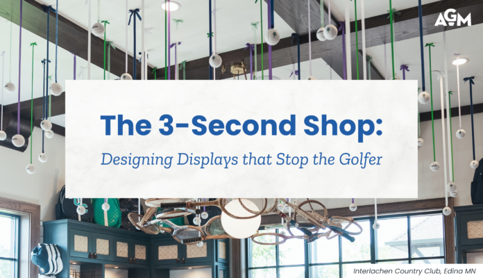
The 3-Second Shop: Designing Displays that Stop the Golfer
The 3-Second Shop reveals why golfers decide in seconds whether a display deserves their attention—and [...]
Jul

Merchandising Like a Museum Curator: The Art of Retail Storytelling
Discover how retail storytelling can transform golf shop displays into engaging experiences that guide members [...]
Jul
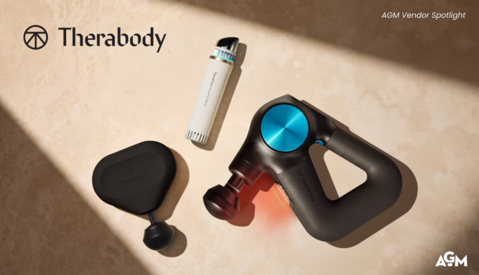
Beyond the Round: Therabody’s Approach to Everyday Wellness
As golfers prioritize overall well-being, wellness products are creating new opportunities for golf shop merchandising.
Jun

Golf Retailers Are Sitting on Their Biggest Competitive Advantage and Don’t Even Realize It
Golf retailers' biggest competitive advantage is human connection. Discover how community drives loyalty and sales.
Jun